Missing the basics on your e-commerce site can cause more than two-thirds of shoppers to flee, according to Retail Dive.
As a result, many shoppers could be leaving before they even hit the “Add to Cart” button. Fortunately, there’s good news.
We have identified three fundamental elements to a great e-commerce customer experience:
- Performance
- Aesthetics
- Relevance
We even created a checklist!
We call it the P.A.R. Checklist. Our e-commerce customer experience checklist identifies the functionality your e-commerce site offers and provides simple suggestions on what you can do to improve.
Let’s break down each of those key performance, aesthetics, and relevance elements.
- Performance – The Need for Speed
Performance is the top priority. If your site isn’t fast, your aesthetic and relevance efforts won’t have much impact at all. According the E-commerce Benchmark KPI Study, “reducing the average load time by 1.6 seconds would increase annual revenue growth by 10%.”
A delay in product page load or a search query may result in a lost customer. Forever.
Famously, back in 2006, Amazon presented one of the first studies linking a clear causation between page load time and online customer revenue. Through A/B testing, they showed every 100 millisecond delay in page rendering time resulted in a 1% loss of sales.
More recently, Intuit increased conversion rates 24% when they cut load speed from 15 seconds to 7 seconds. And they gained an additional 8% conversion boost when load time went from 7 seconds down to 2 seconds.
If that wasn’t enough pressure, Google now analyzes page speed as a key factor for its organic search-ranking algorithm.
Bottom line: You need to be fast.
Three Ways to Increase Performance of Your Site
The biggest performance killers are often the same things that make your site such a rich engaging experience. Your website is full of product images, content, Javascript, and CSS page elements. That bloats every page.
Fortunately, you have several ways you can increase site speed while keeping your online store appealing to customers.
- Your best first step is to reduce your page size. For e-commerce sites, the best way to do this is to optimize the size of the product images you show.
- Reduce the number of requests. Many browser requests are fired off every time a visitor hits any page on your site. Many requests ask for the same elements for each page. Speed things up by caching the elements that are repeatedly downloaded.
- Shorten the distance to your customers by using a Content Delivery Network (CDN). The closer your data centers are to your customers, the faster your website loads. CDN services give you a global network of servers. That shortens the distance to your customers, which your website host alone cannot provide.
Google offers even more recommendations to minimize unnecessary bloat on your website.
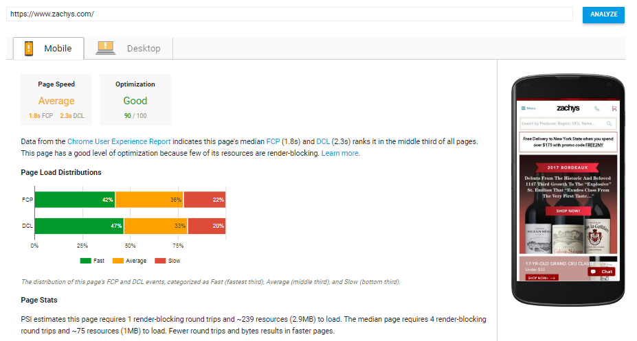
Your Action Item: Visit Google PageSpeed Insights. Enter your website URL. See how Google rates your performance. Follow Google’s optimization suggestions to get your site up to speed.
 Now that you’re up to speed, let’s boost sales with top e-commerce aesthetic best practices.
- Aesthetics Are More than Beauty Alone
Online businesses all want beautiful websites. You want your products to appeal to shoppers. But a beautiful website doesn’t mean it’s tuned to sell.
Your top priority is to drive transactions. Your key pages need to be focused on sales and appearance. Otherwise, those shoppers are “just looking” at your beautiful website. And you’re dramatically less likely to make a sale.
The Best Place to Start Online Merchandising
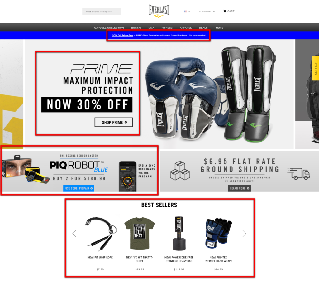
Do you merchandise specific products on your homepage? If not, you need to. You want to get your visitors directly to a product page where they can purchase.
Yet, many e-commerce sites use valuable homepage real estate to promote general categories and shopping ideas, not specific products. Or online stores display big, beautiful “brand experience” images that push anything sales-related down below the fold.
As a result, visitors are just browsing. They might find the site attractive. But they typically won’t move forward toward purchase. They meander. And pretty quickly they are off your site. Nothing in their cart. Or best case, an ineffective homepage simply means shoppers need to make more clicks to maybe find what they want. That’s not good either.
Your Action: Merchandise specific products that visitors are likely to add to their shopping carts right away. Better yet, use AI to determine which products to feature.
Get shoppers in a buying mindset with product recommendations like “Top Sellers” and “What’s Hot” on your homepage.
 You can apply this same beautiful, yet impactful merchandising approach to other critical shopping elements, like your navigation, category pages, product pages, and your shopping cart.
The P.A.R. Checklist gives you even more concrete actions you can take to boost sales with a better, more aesthetic shopping journey.
So you know how to increase your site speed. And you’re tuning your site to be beautiful and effective at selling.
Now let’s address the critical e-commerce factor that helps you go from great to world-class.
- Relevance – The Secret Weapon to a Higher Conversion Rate
Fast product discovery is critical to sales. Shoppers can’t buy what they can’t find.
Your customer experience needs to be tuned to answer one question: “What is my visitor most likely to buy right now?”
That’s relevance.
Relevant product discovery is proven to increase site-wide conversion rates 19% and average revenue per visit 72%, according to sales analysis of 40 top retailers.
So you need to merchandise hyper-relevant products throughout the shopping journey.
Your Search Box Is Your Revenue Box
SLI studies have found that visitors who use search buy at a 2.7x greater rate than visitors who just browse.
Search users show a higher buying intent by indicating exactly what they want, often including the brands, specifications, materials, and colors they are looking for.
Your search results need to offer more than simple keyword matching from product feed data. You also need to factor in behavioral data from previous visitors.
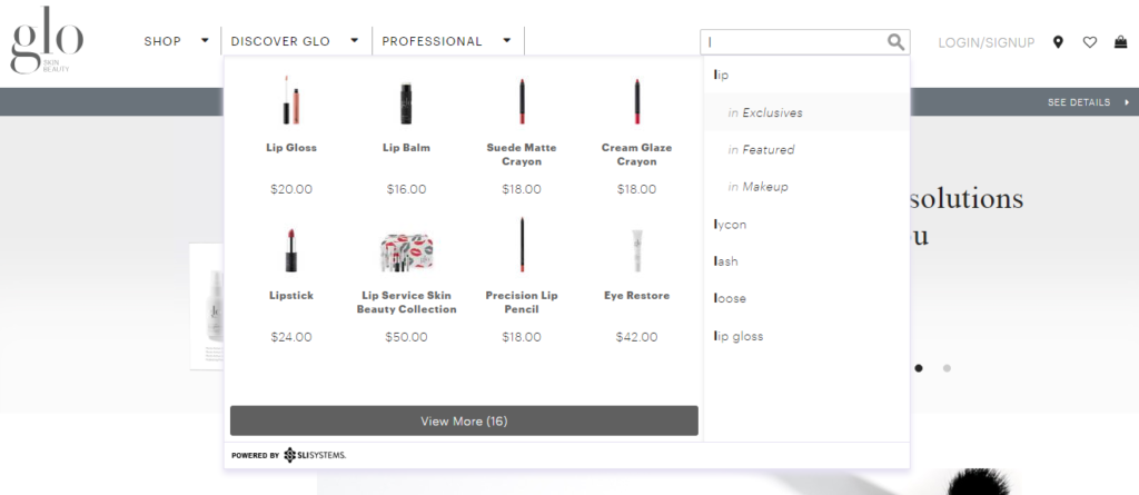
The most effective e-commerce sites display hyper-relevant search results with the products shoppers are most likely to buy. You can further accelerate the path to purchase with autocomplete functionality in your search box.
Display relevant suggestions as soon as shoppers begin to type. Make sure to order those suggestions based on popularity to further speed up the purchase path.
Your Action: Turn your autocomplete into rich autocomplete. Expand the suggested terms to merchandise specific products with images. Eliminate extra browsing and make your suggestions visual to enhance conversion rates.

In fact, relevancy is crucial to optimizing many online merchandising functions. Your product recommendations engine, personalization features, and even your SEO efforts can be dramatically improved with greater relevance.
Is Your E-commerce Website Up to P.A.R.?
You understand why Performance, Aesthetics, and Relevance can have a big impact on your online sales. Now it’s time to evaluate your e-commerce website.
You’ve got a prioritized to-do list instantly ready for you. The P.A.R. Checklist provides easily actionable recommendations for each element. And each best practice is ranked in priority order.


